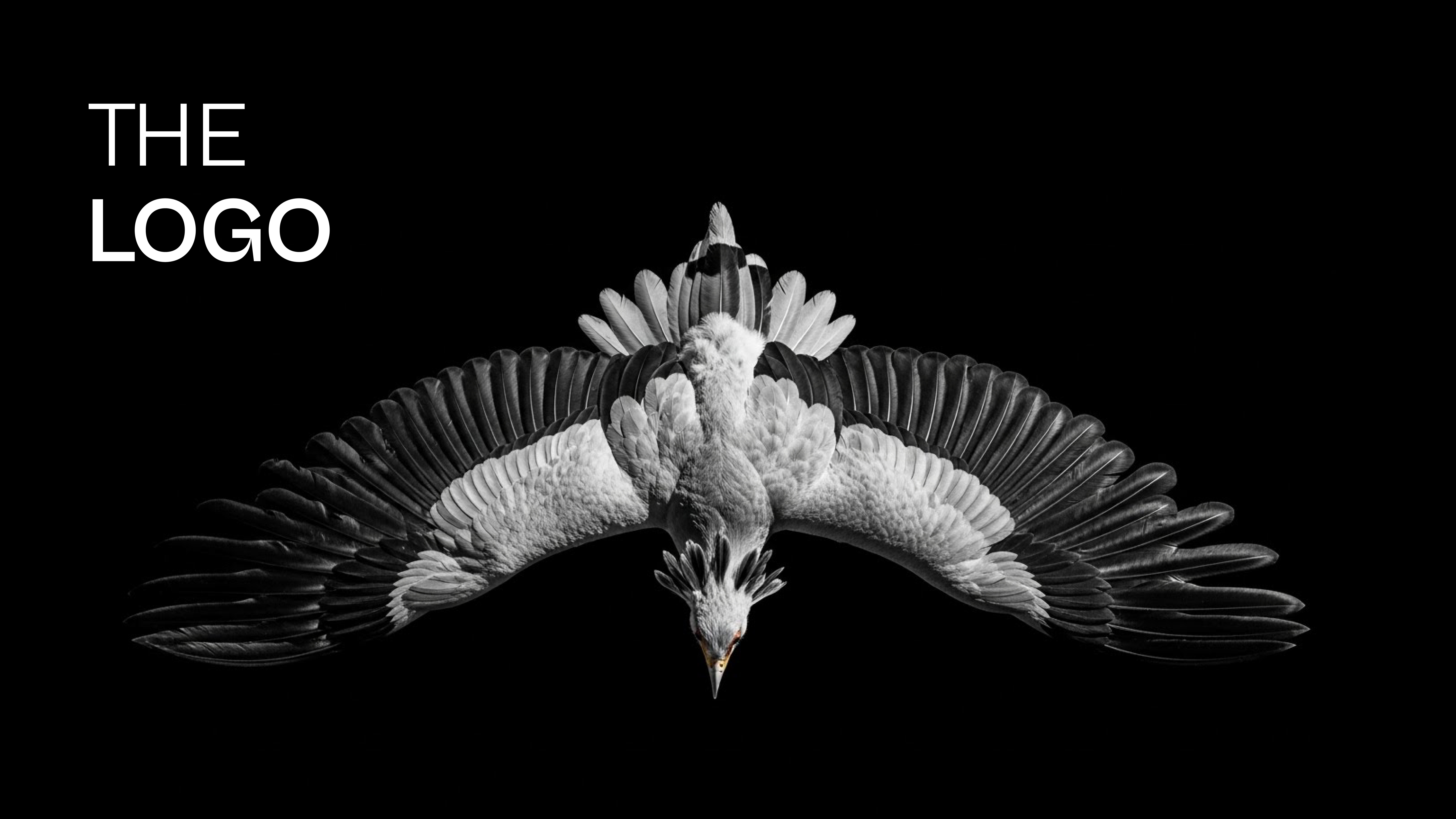
Agunwa
Has someone ever called you a name that captured your essence? That is how Agunwa began. A personal brand rooted in bravery, strength, and intentional action. Here is the visual identity, the logo, and the philosophy behind it.
"Agunwa — in Igbo, is used to refer to strong people. A name for those who embody strength and courage."In Igbo, Agunwa is used to refer to strong people. It felt right the first time someone used it for me. It aligned with everything I was, everything I am, and everything I seek to be. Strength, boldness, the refusal to back down when things get hard. Agunwa is all of us.
The Start
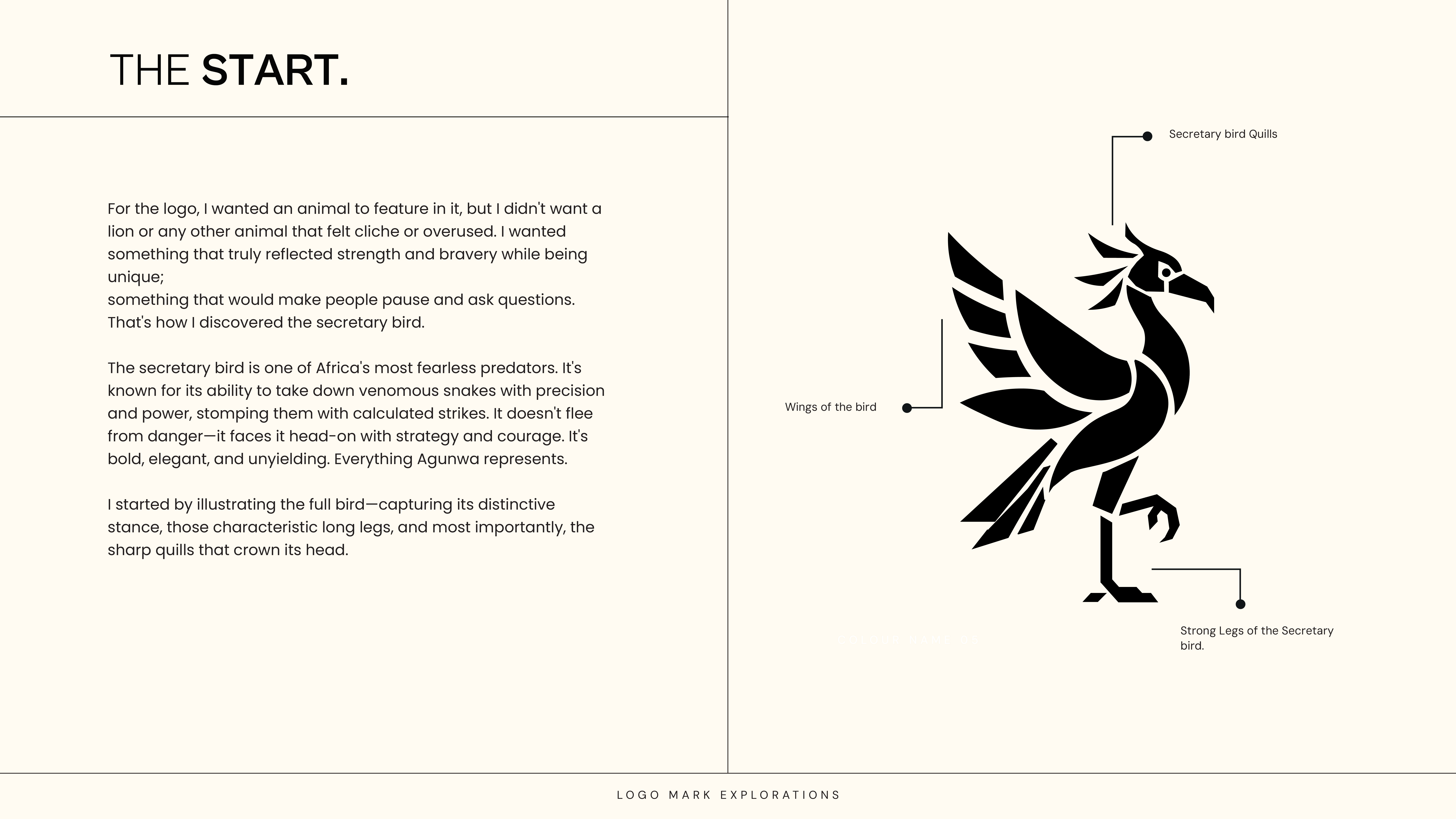
For the logo, I wanted an animal. Not a lion, not anything that felt cliche or overused. I wanted something that would make people pause and ask questions.
The secretary bird is one of Africa's most fearless predators. It does not flee from danger. It faces it head-on. Bold, elegant, unyielding. When I discovered it, I knew.
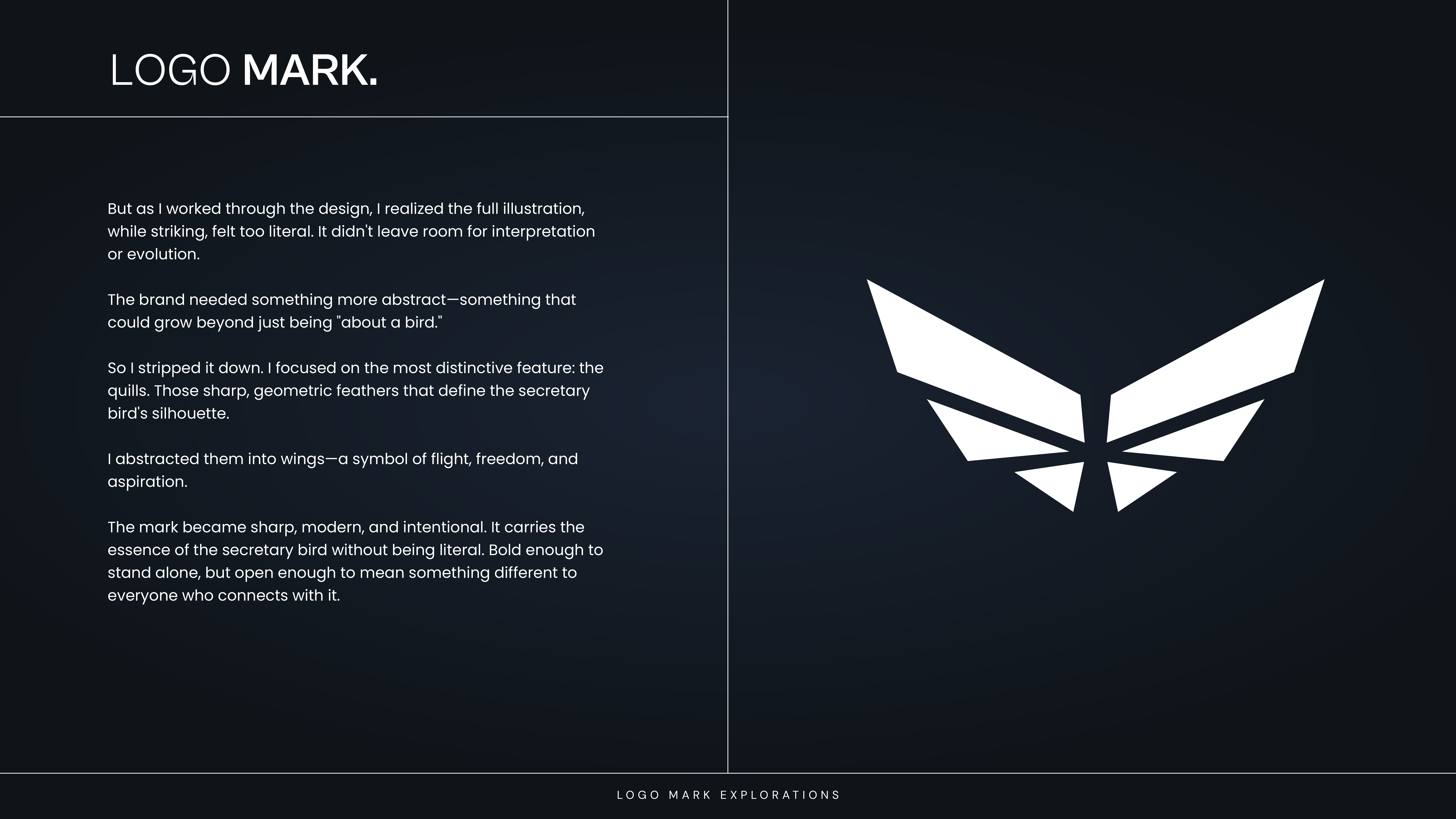
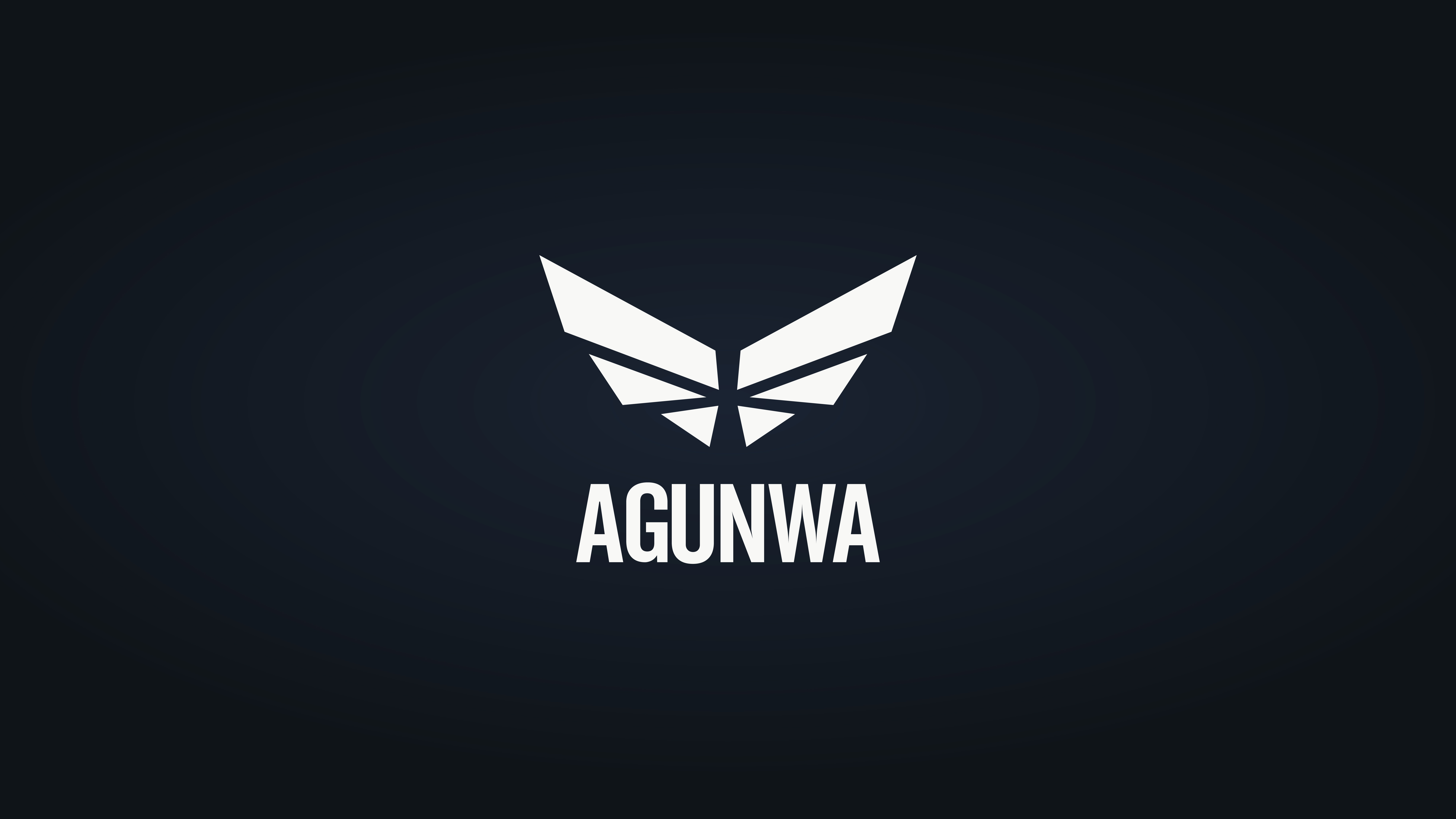
I started by illustrating the full bird. Then I realised it was working too hard. It did not leave room for the brand to breathe or evolve. So I stripped it down to the most distinctive feature: the quills. Those sharp, geometric feathers. I abstracted them into wings, a symbol of flight, freedom, and aspiration.
The mark became sharp, modern, and intentional. It carries the essence of the secretary bird without being the secretary bird. Bold enough to stand alone, open enough to mean something different to everyone who connects with it.
The Mark
The icon is built from the secretary bird's quills, abstracted into a wing form that doubles as an upward arrow. Every time you see it, it is pointing somewhere. Progress encoded into the shape itself.
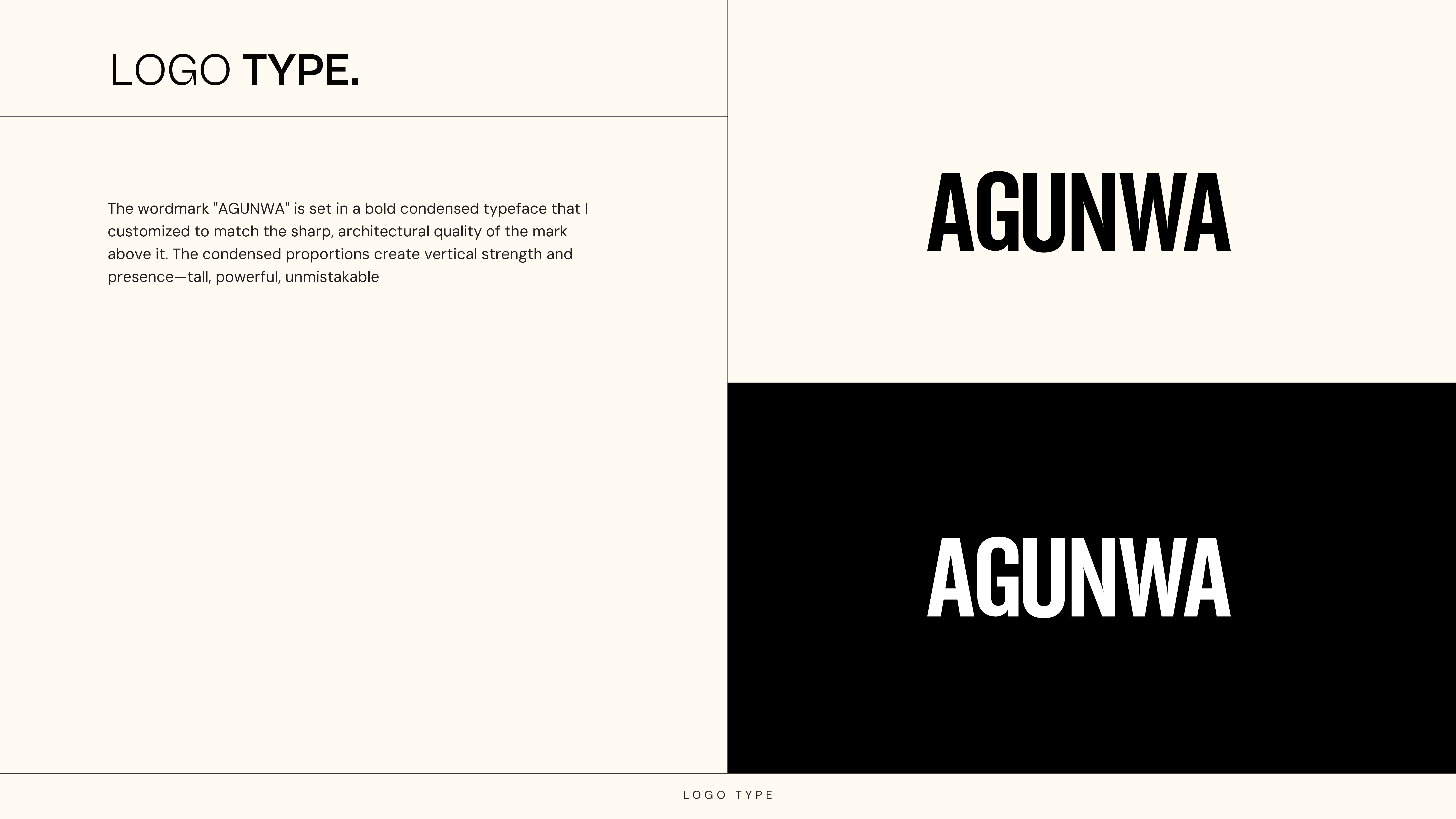
The wordmark "AGUNWA" sits in a bold condensed typeface. The condensed proportions create vertical strength and presence. Tall, powerful, unmistakable.
At the end of the wordmark sits a diamond. Rotate it and it becomes a square, a direct nod to Squared, the community I founded. But a diamond also means something on its own. Strength under pressure, value, beauty, resilience. It is the kind of detail that rewards people who look closely.
The Colour
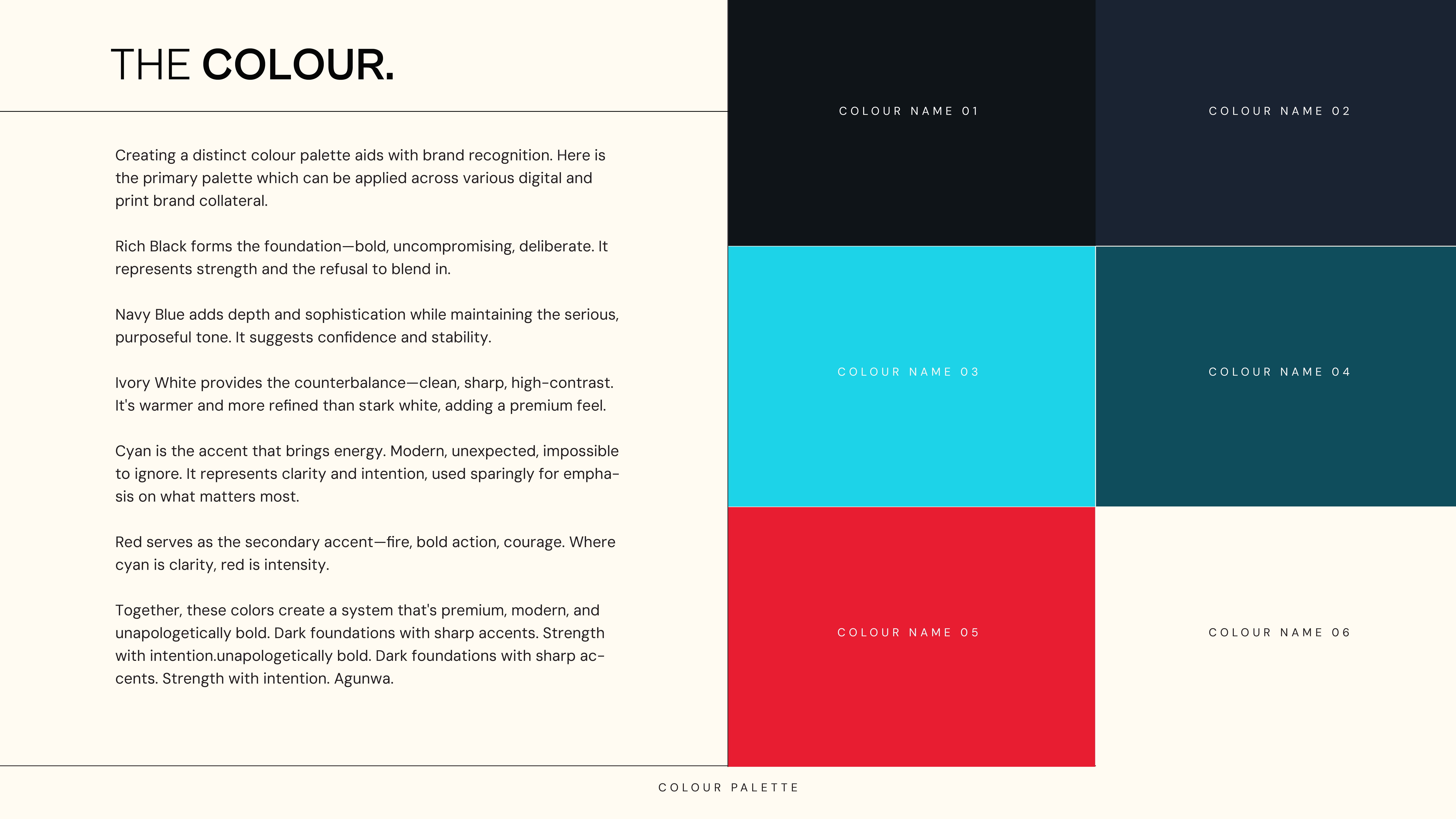
The palette was built for recognition. Something that could be applied across digital and print without losing itself.
Rich black is the foundation. Uncompromising, deliberate. It represents strength and the refusal to blend in. Navy adds depth. Ivory is the counterbalance, clean and high contrast. Cyan is the accent that brings energy. Modern, impossible to ignore. Clarity and intention made visible.
Together they create a system that is bold and passionate. Dark foundations with sharp accents. Strength with intention.
In Motion
A brand identity does not end on a page. It moves, it breathes, it shows up in the moments between the static assets. The motion work captures the same energy as the mark. Sharp, intentional, built for more.
Mockup / Merch
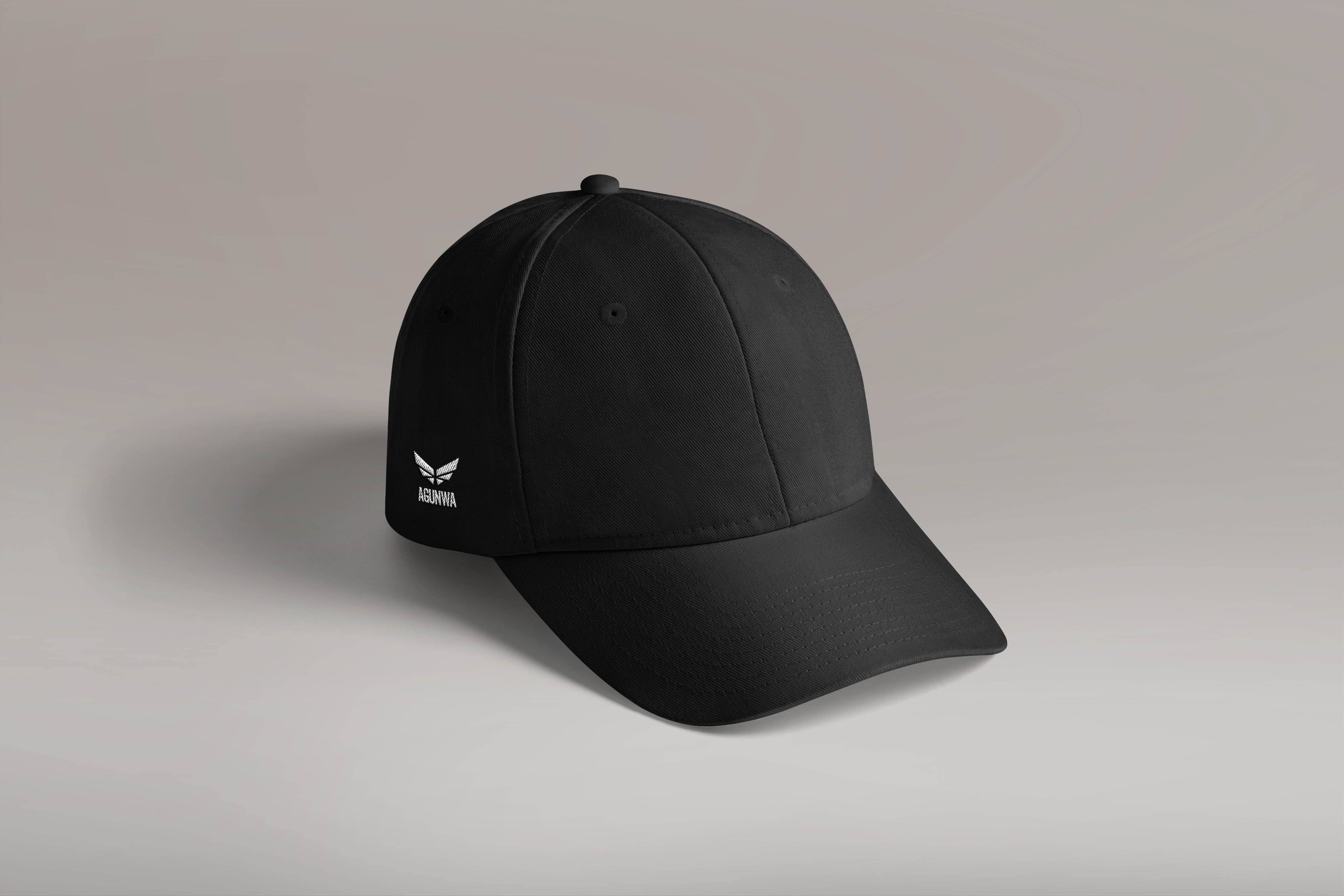
A brand identity only becomes real when it leaves the screen. We extended the Agunwa system into physical product — starting with a cap. Simple, wearable, intentional. The mark sits cleanly on the structured front panel, the kind of detail that reads from across a room without trying.
Merch is not an afterthought here. It is proof that the identity holds up in the real world, on real surfaces, worn by real people. That is the standard we built toward.
Built for more.