Squared
The Brief
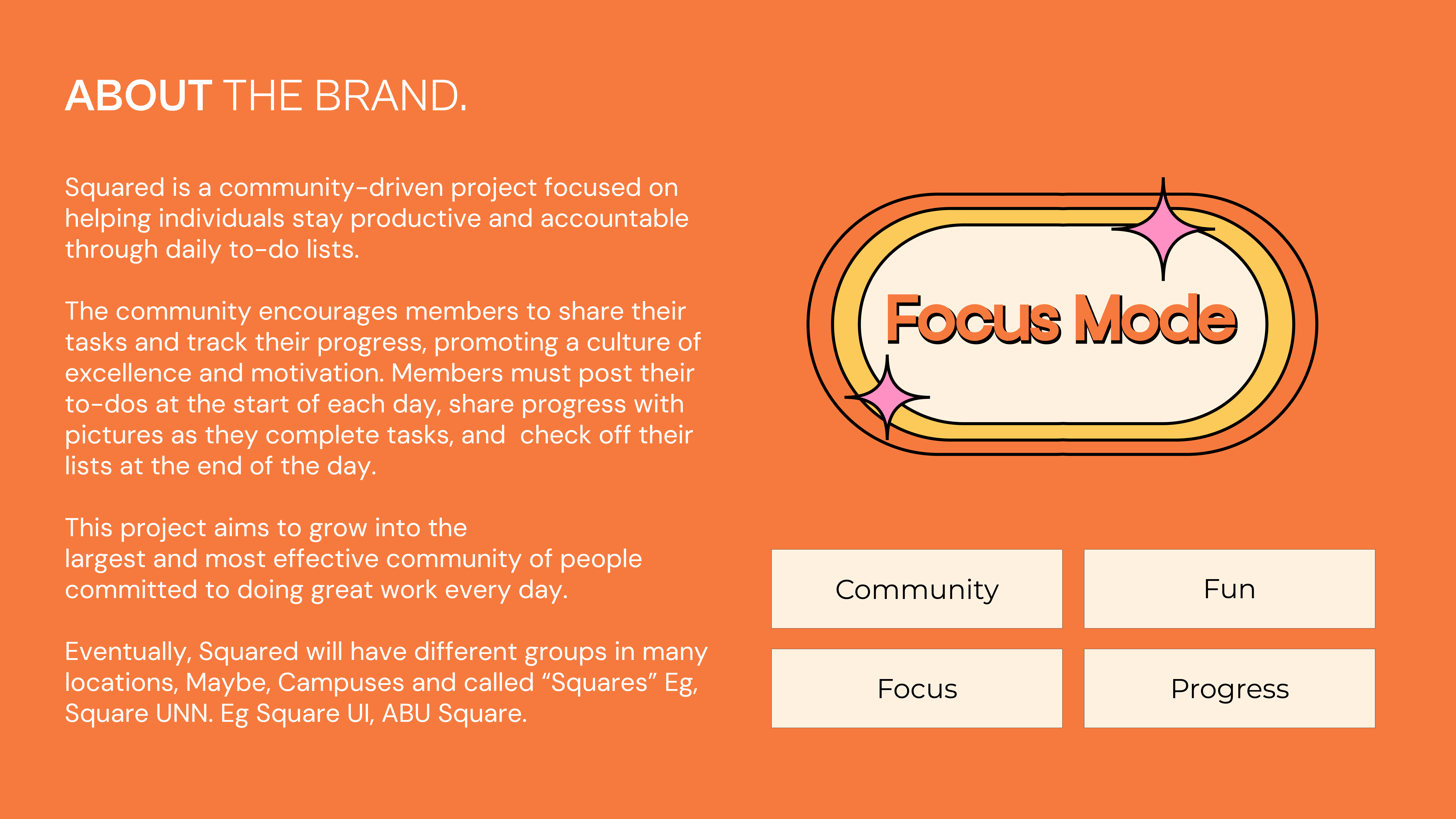
Squared is a community-led initiative built around one idea — Do Great Work Every Day. Members post their tasks each morning, share progress through the day, and close out their list by night. Accountability made visible. Discipline made communal.
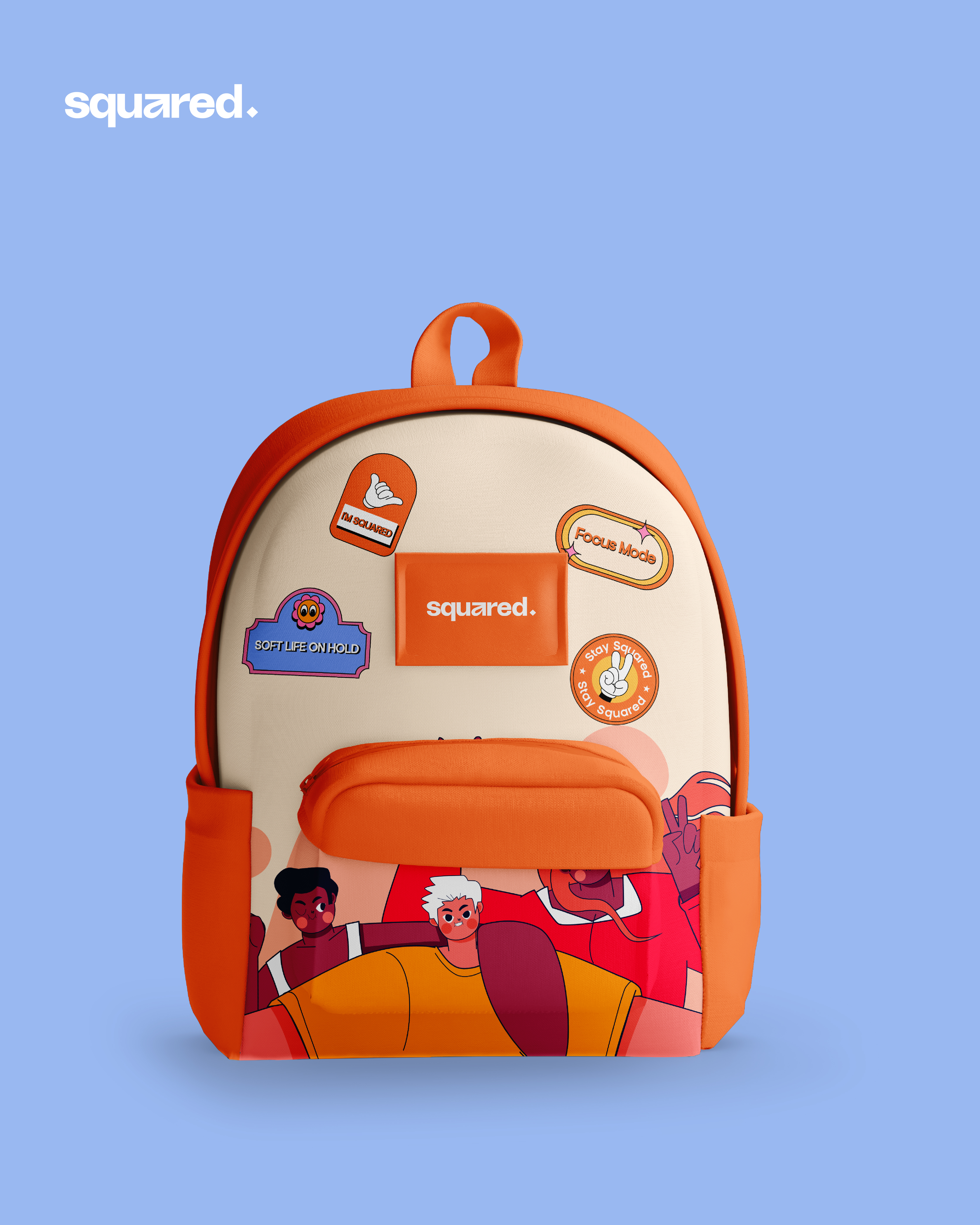
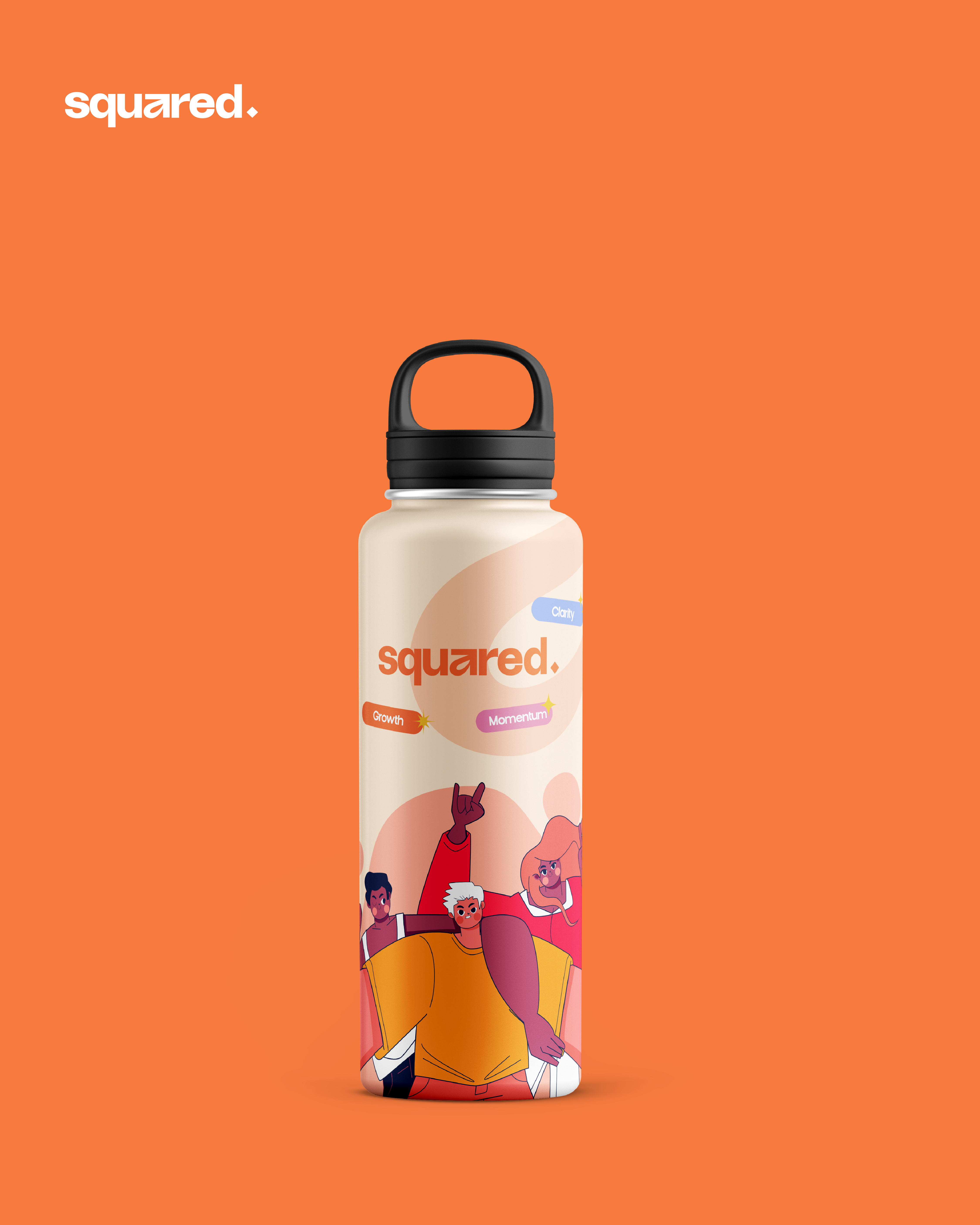
The brief was to build a cohesive identity from scratch. Not just a logo — a full visual language that could live on stickers, patterns, icons, digital screens, and print. Something that captured the energy of people who show up every day and do the work. We started from zero and built something we're genuinely proud of.
The Moodboard
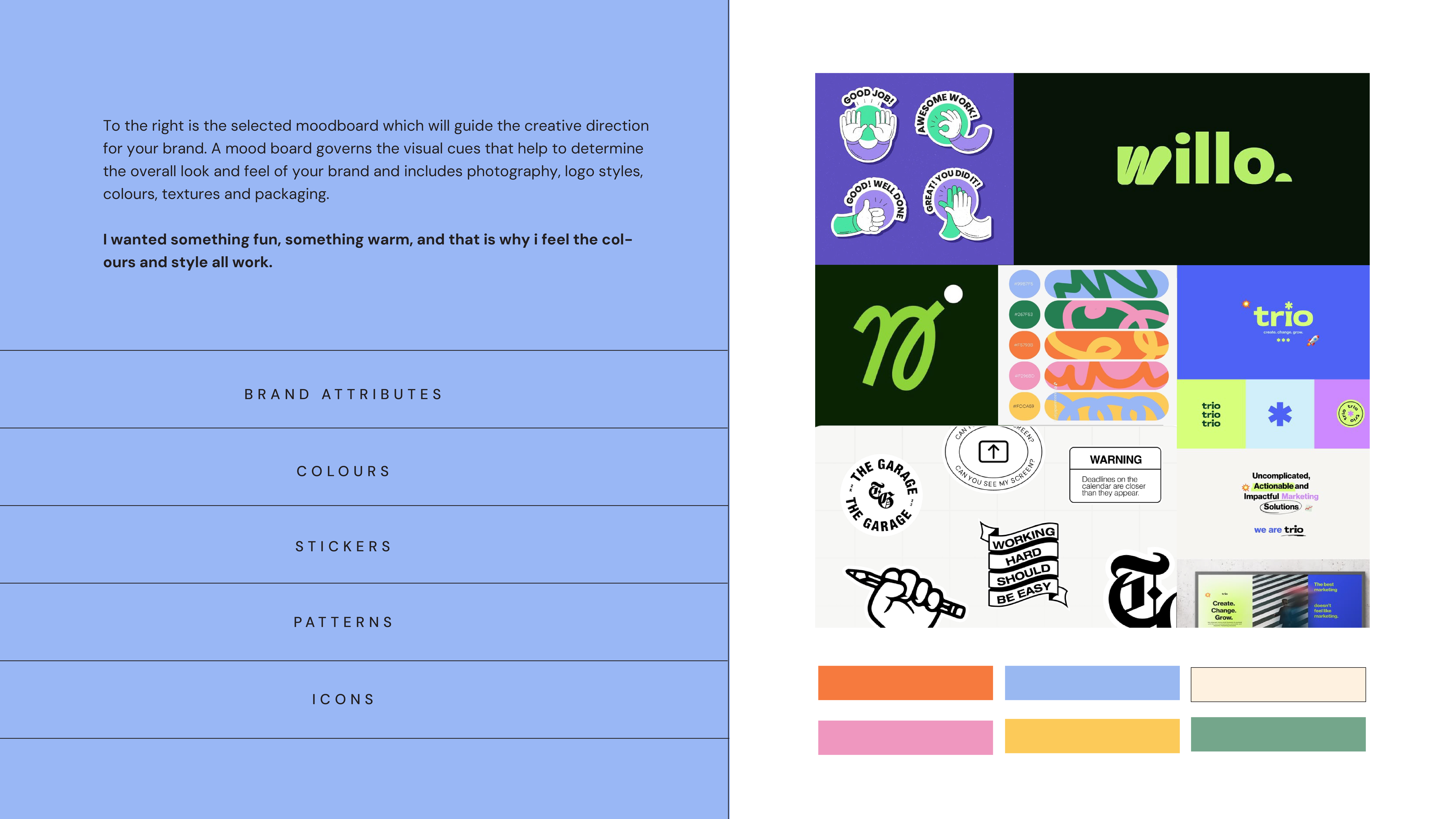
Before a single mark was made, we gathered. References, textures, type specimens, photography — anything that carried the feeling we were chasing. The moodboard wasn't a mood in the casual sense. It was a filter. A way of agreeing, before the work began, on what the brand should feel like in someone's hands.
We kept coming back to the same qualities: warmth without softness. Energy without noise. The kind of fun that comes from people who take what they do seriously but never take themselves too seriously. These weren't just aesthetic preferences — they became the criteria every design decision was tested against.
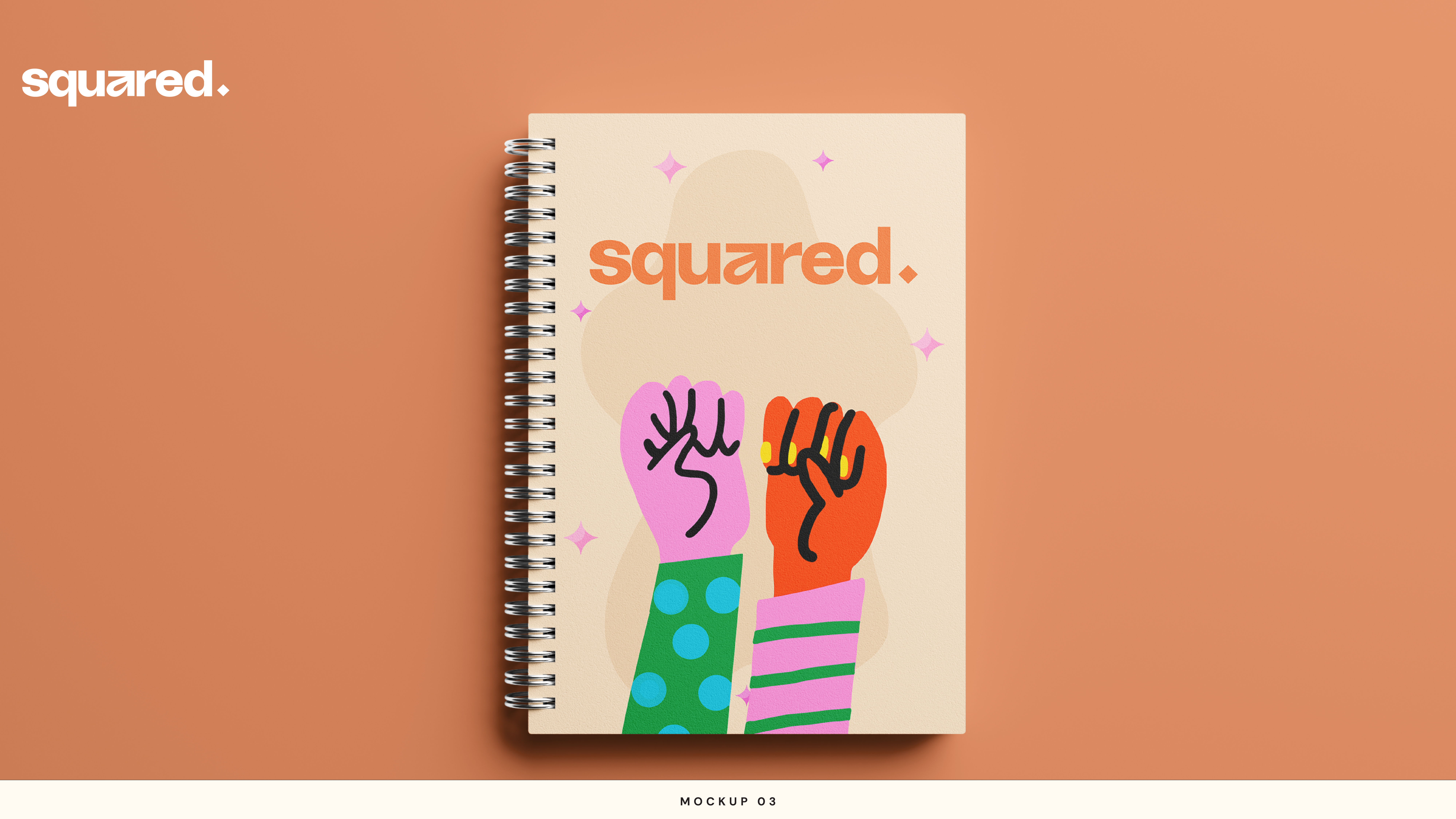
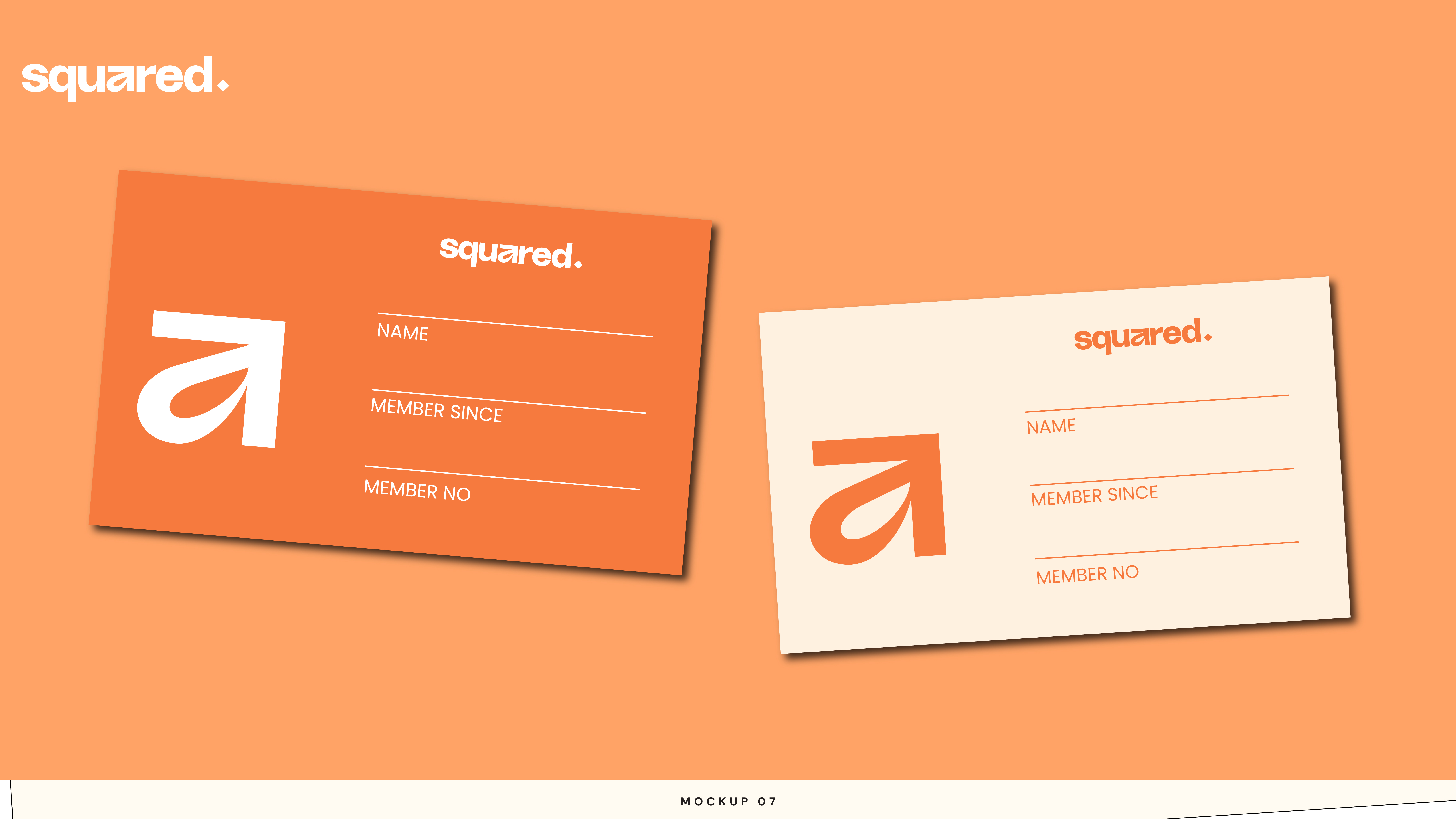
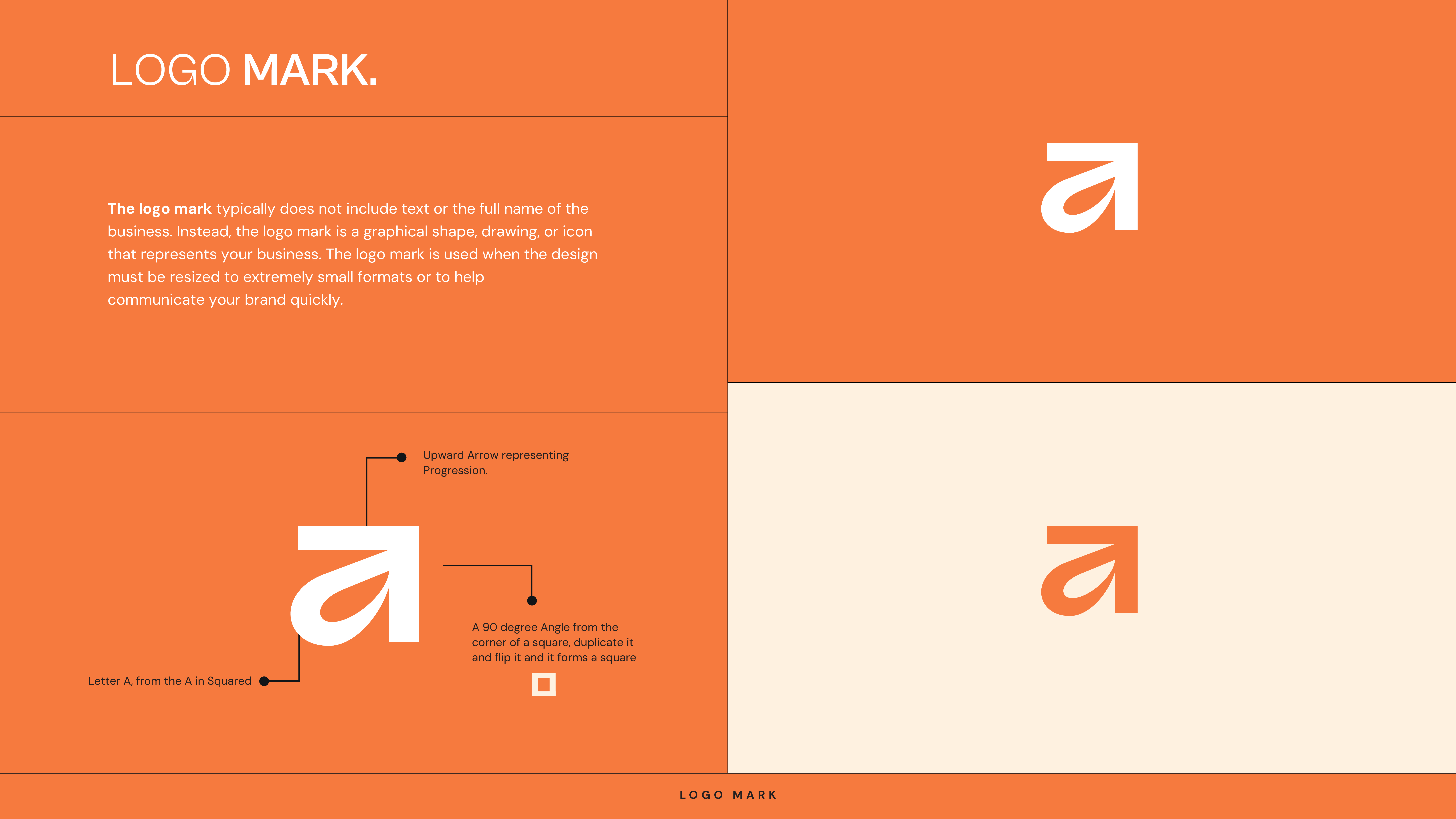
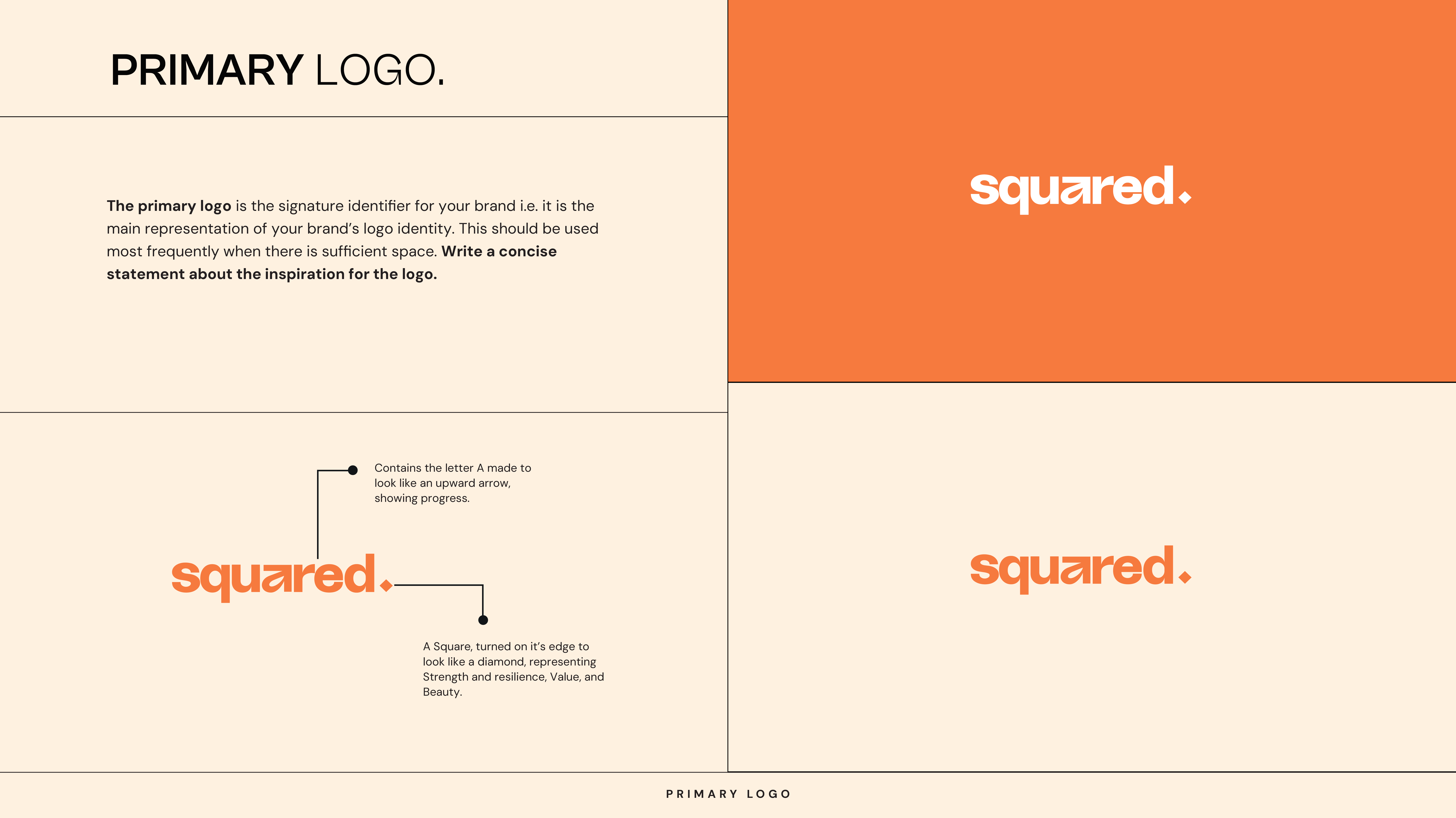
The Mark
The Squared icon is a letterform and a symbol at once. The "A" in Agunwa — but drawn so its negative space reads as an upward-pointing arrow. Progress encoded directly into the letter. Every time you see the mark, it's pointing somewhere.
At the end of the wordmark sits a diamond. Rotated, it's a square — a direct nod to the brand name. But a diamond also means something: strength, resilience, value, beauty under pressure. It's the kind of detail that rewards people who look closely.
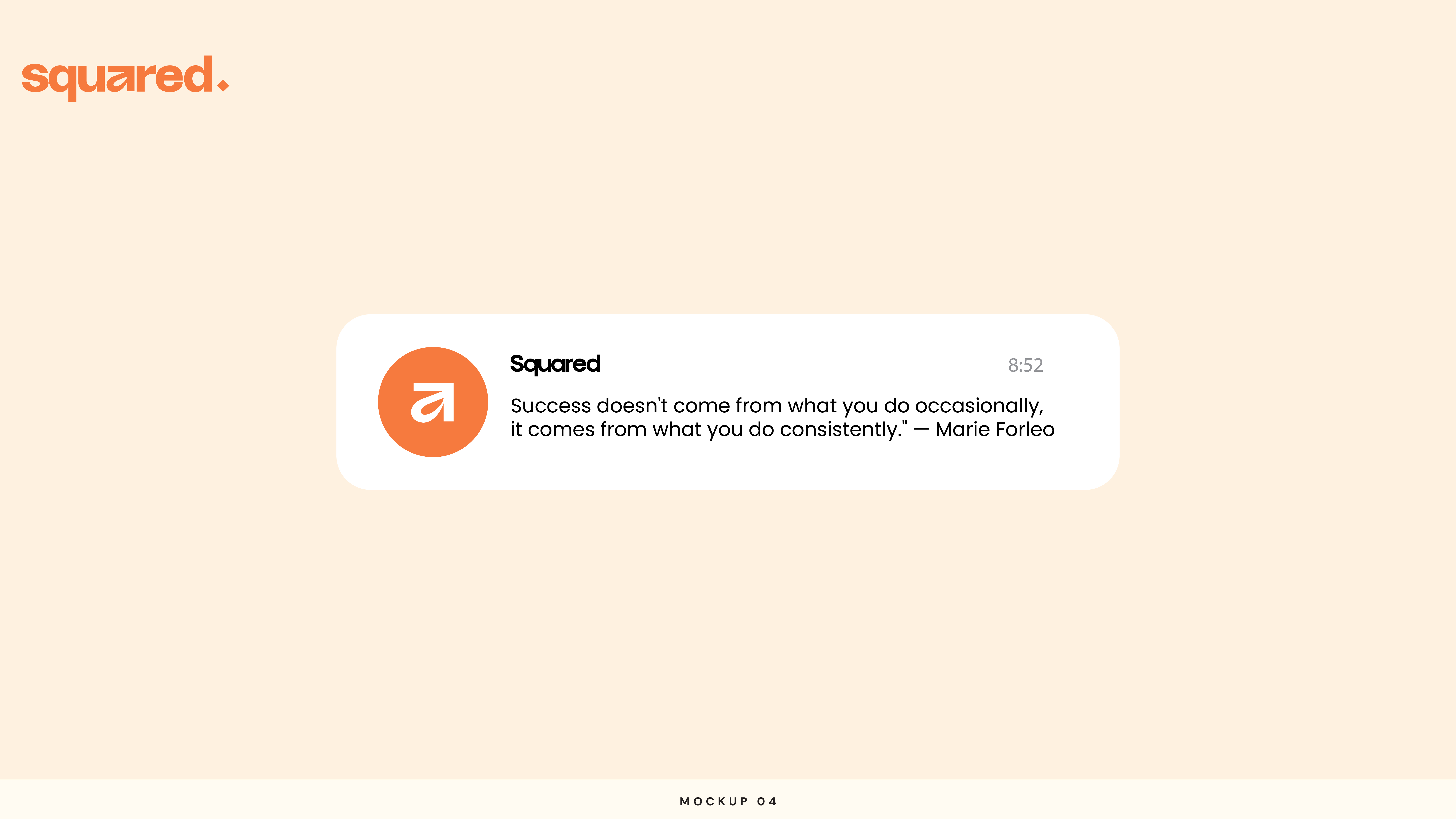
Colour and Language
The palette was chosen to feel warm and energetic without being loud. Orange as the lead — action, momentum, optimism. Paired with neutrals that let the content breathe. The typography follows the same logic: structured enough to feel disciplined, human enough to feel approachable. Every choice reflects the people the brand is for.
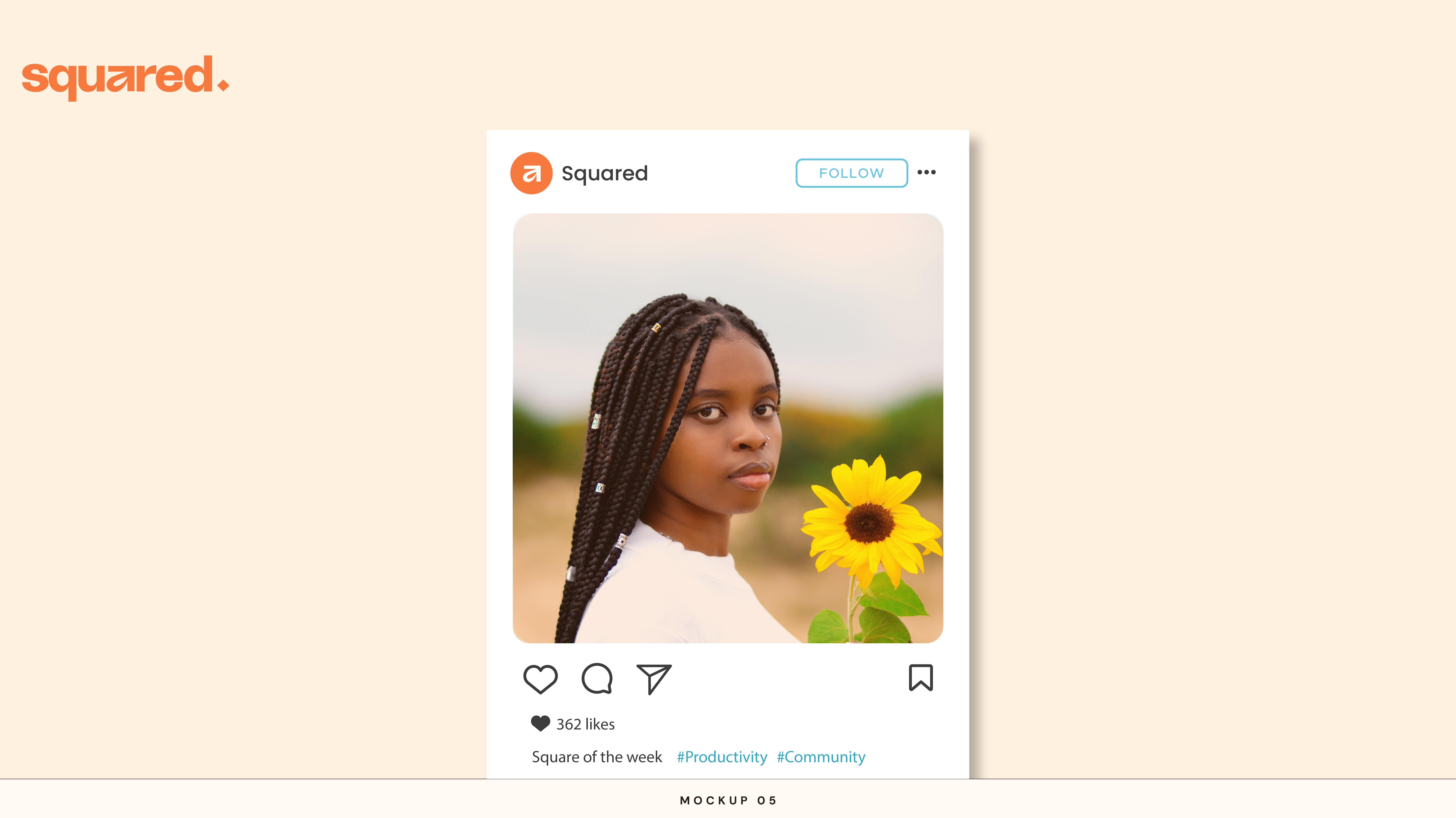
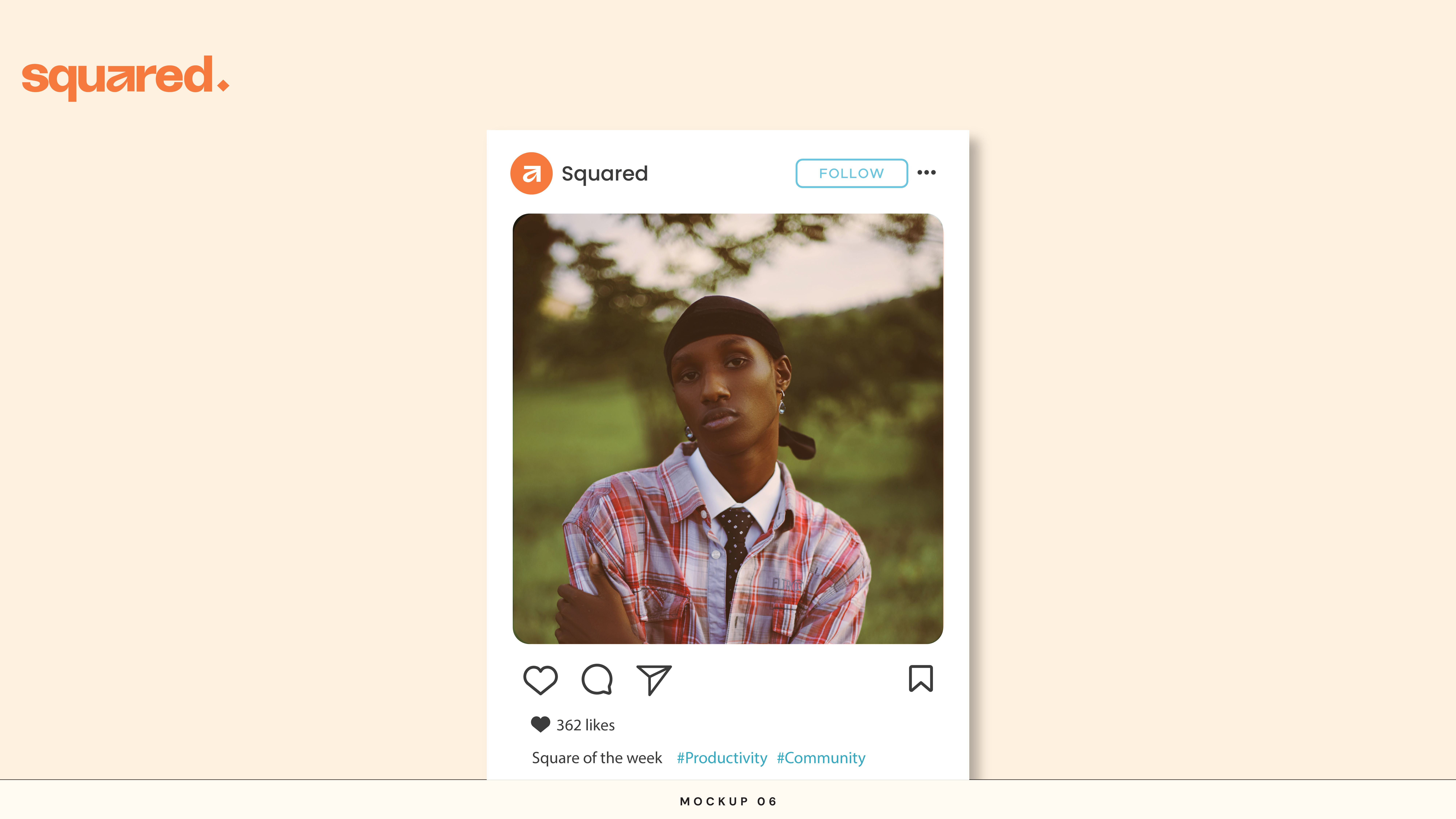
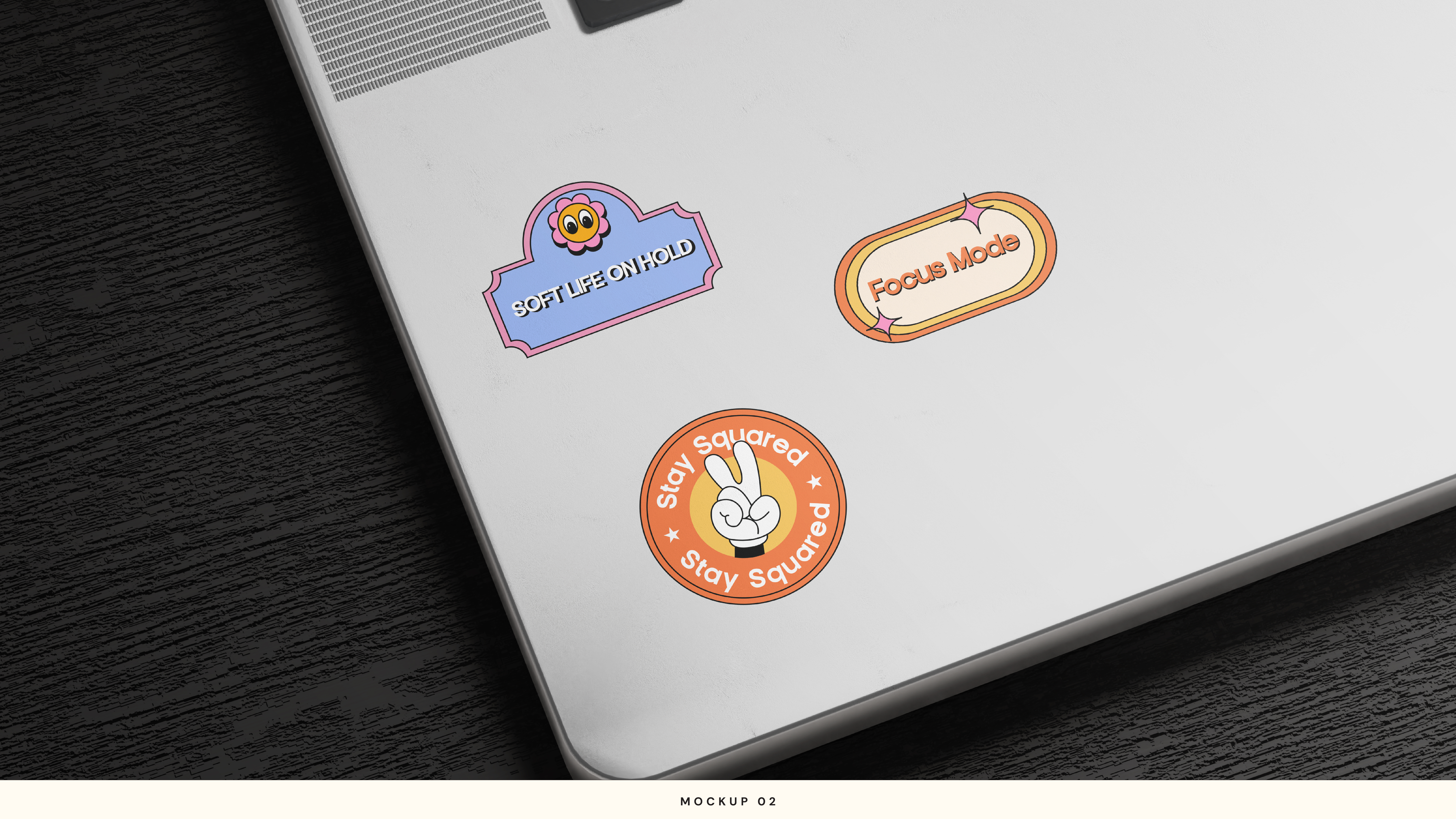
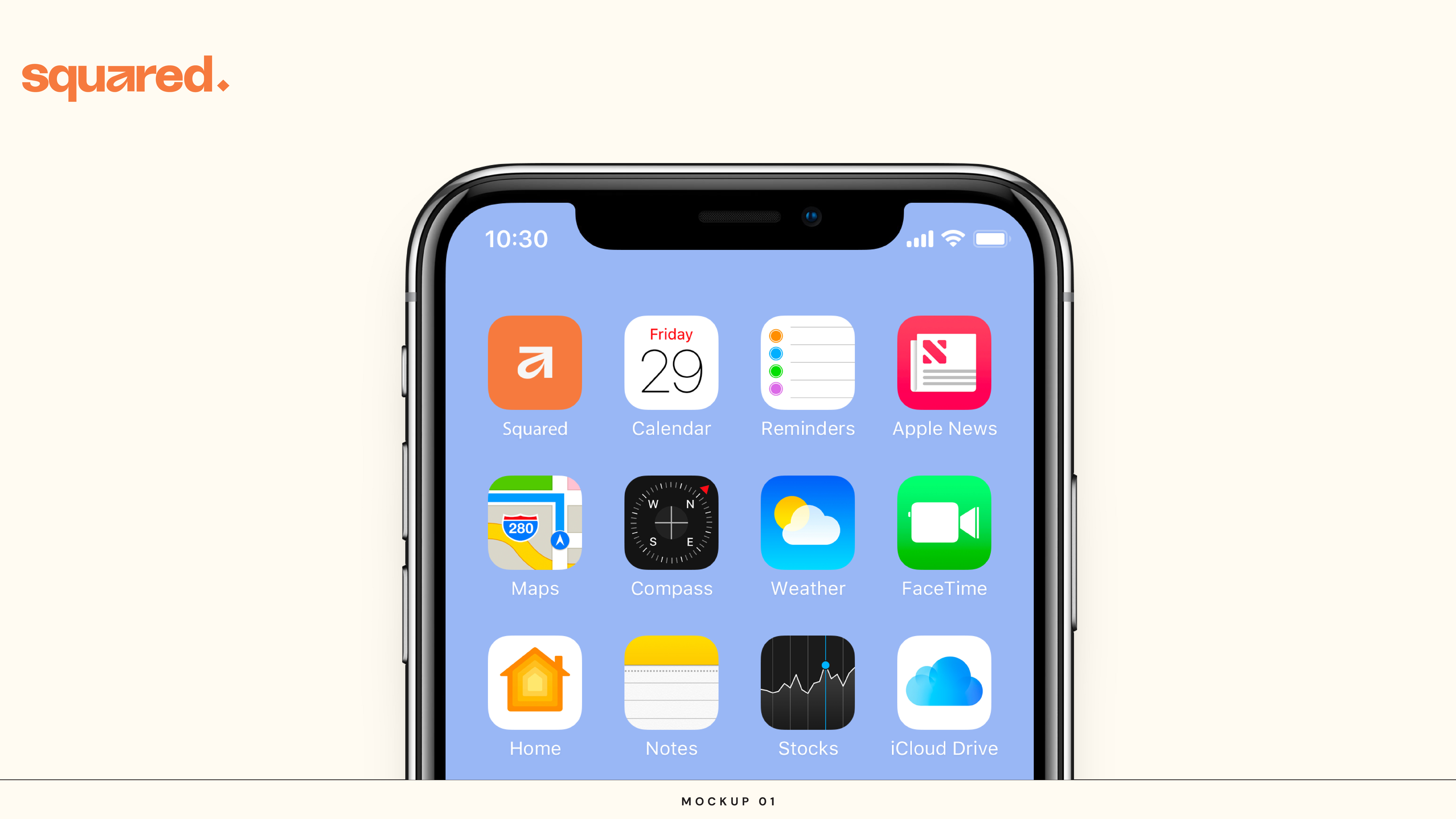
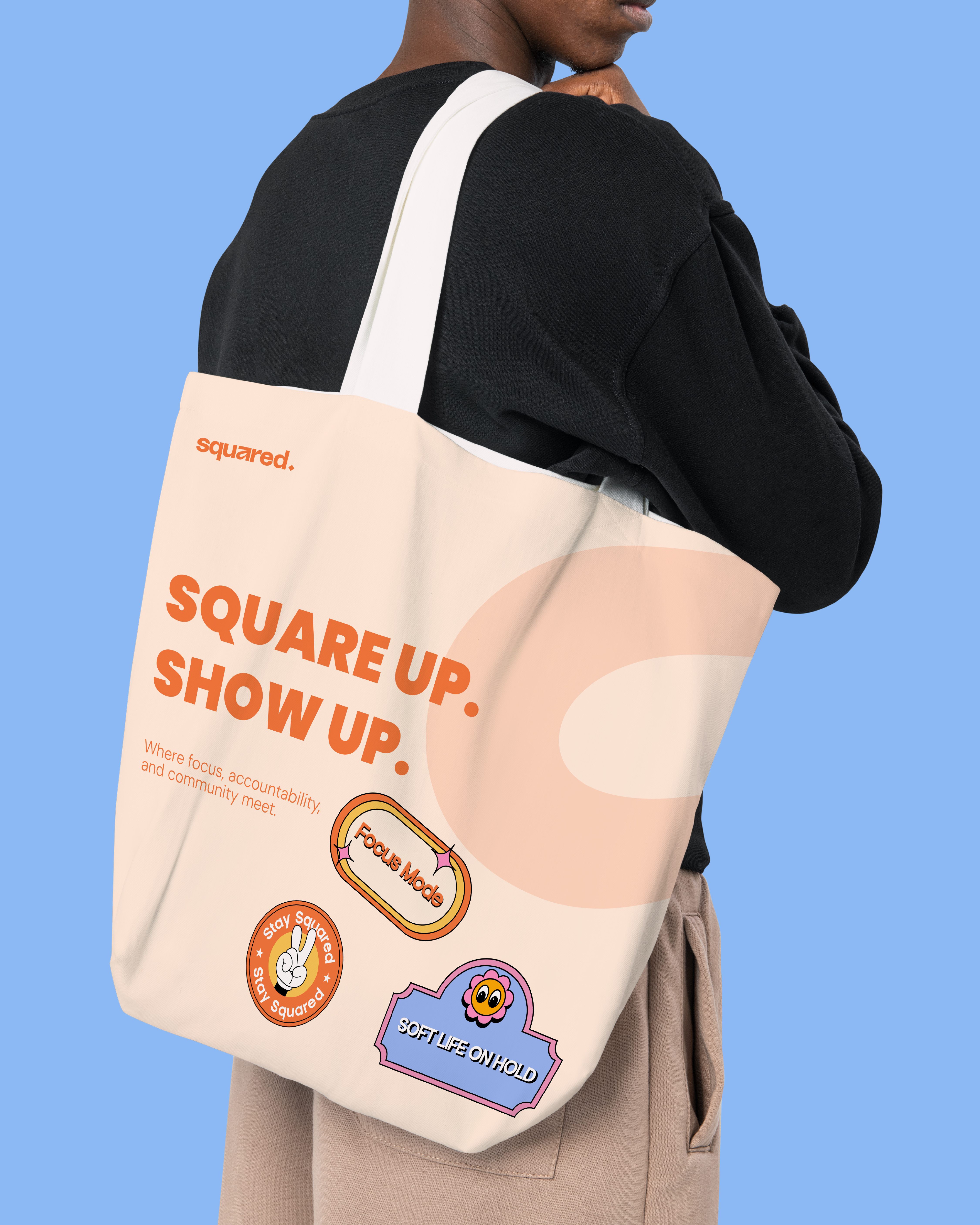
In the Wild
A brand identity only works when it lives outside the guidelines document. These are the moments that matter — the app screen, the sticker sheet, the pattern in the background of a post. Squared needed to feel alive across all of them. We think it does.